
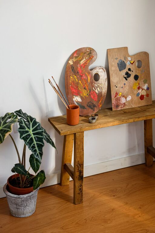
Creating a peaceful and inviting home environment often begins with one crucial element: color. The colors you choose for your walls, furniture, and décor can greatly influence the mood of your living space. Calm colors help reduce stress, promote relaxation, and make your home feel like a true sanctuary.
In this post, we’ll explore practical tips for choosing calm colors for your home, helping you craft a soothing atmosphere that suits your personal style.
Why Choose Calm Colors?
Before diving into color choices, it’s helpful to understand why calm colors matter. Colors have psychological effects; they can energize, comfort, or relax us. Calm colors are generally soft, muted shades that don’t overwhelm the senses. They create balance and harmony, making them perfect for spaces intended for rest, reflection, or intimate gatherings.
Popular Calm Color Families
When searching for calm colors, certain families of hues tend to work best:
– Blues: Often linked to tranquility and stability, blues can create a serene environment — especially lighter tones like sky blue or soft teal.
– Greens: Reminiscent of nature, green promotes balance and rejuvenation. Pale sage or muted olive are excellent calming choices.
– Neutrals: Soft grays, warm beiges, and creamy whites offer understated calmness and versatility.
– Lavenders and Soft Purples: These convey a gentle, soothing vibe without being overpowering.
– Pale Pinks and Peaches: Subtle warm tones that feel nurturing and comforting.
Tips for Choosing Calm Colors
1. Consider the Room’s Purpose
Think about how you plan to use each room. Calm colors work wonderfully in bedrooms, bathrooms, and living spaces where relaxation is key. For example, soft green in a bedroom can help create a restful atmosphere, while a muted blue in a living room invites calm conversations.
For more active areas like kitchens or home offices, you may want a balanced calm color with a bit more energy, such as a warm neutral or dusty blue.
2. Test Colors in Different Lighting
Natural and artificial lighting can change the appearance of colors. A shade that looks calming under natural daylight may feel dull or cold under indoor lighting.
Before making a final decision, paint large swatches on your walls or use sample boards. Observe the color throughout the day and night to see how it shifts with light changes.
3. Use Soft, Muted Shades
Avoid colors that are too bright or saturated if you want a truly calming effect. Instead, focus on muted tones that have gray or white mixed in to soften their intensity.
For example, instead of a bright blue, choose a powder blue with gray undertones. This will feel gentler and more soothing to the eyes.
4. Pair Colors Thoughtfully
Combining calming colors can enhance the peaceful vibe of your home. Complementary palettes using different shades of the same color, like pale green with sage and soft olive, create depth without disrupting calmness.
Neutral colors pair well with almost any calm shade and help ground the space. For instance, soft beige walls with hints of lavender accents can add subtle warmth.
5. Incorporate Texture and Natural Elements
Colors don’t work alone. The textures and materials in a room affect the overall mood. Soft fabrics, natural wood, and plants enhance calmness by adding warmth and organic beauty.
Even a calm color can feel sterile if paired with too many hard or reflective surfaces, so balance your palette with cozy textures and greenery.
6. Limit Contrasts and Bold Accents
While small pops of color can add interest, too much contrast can disrupt the peaceful feeling. Keep bold accents minimal and opt for colors that harmonize well with your main calming palette.
Use accent pieces like cushions, rugs, or artwork in gentle hues or subtle patterns that complement your paint colors.
Suggested Calm Color Combinations
To get you started, here are some calming color combos that work beautifully together:
– Pale blue walls with white trim and light gray furniture
– Soft sage green paired with warm beige and natural wood accents
– Light lavender combined with creamy white and soft pink accessories
– Warm gray walls with muted teal and soft peach details
Final Thoughts
Choosing calm colors for your home is about creating a space where you feel peaceful and comfortable. Take your time exploring shades, consider the atmosphere you want to build, and don’t hesitate to test samples before committing.
Your home should be a place that nurtures your well-being, and the right calming colors can make all the difference in achieving that sense of serenity.
Remember, calm color choices are flexible and personal. Trust your instincts and enjoy the process of making your home a relaxing haven.